This month Michelle's Scrapbooking is sponsoring our design team - one selected DT member will be showing off their digi stamps each week of this month.
Our Monthly Sponsor

Michelle's Scrapbooking & More is the home of The Pixie Cottage stamps, with many different illustrators/artists contributing their art work we have a stamp for every taste. We are now selling not only single stamps, but some stamp sets as well.
Our Challenge this Week
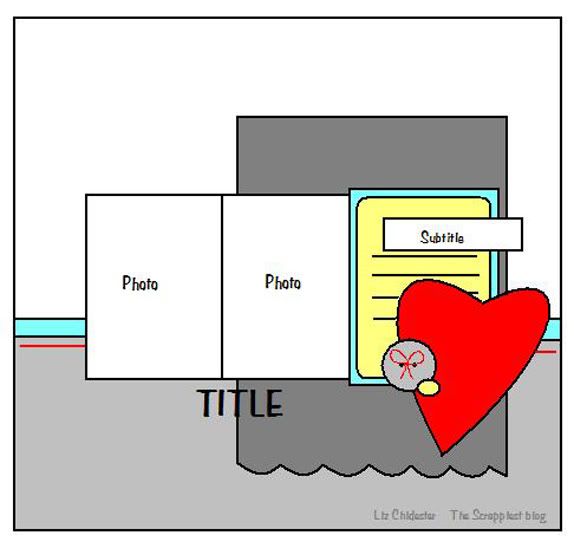
Liz Chidester Sketch
Create any project you wish using this sketch as your inspiration.
Our Designer Reveal
C
C used this week's layout sketch challenge to highlight a wonderful digital stamp from Michelle's Scrapbooking & More called Piggy Party. The pig image and the party hat perfectly coordinated with the hat in the birthday pinata. For more details and close up photos of the layout check out Trade Fish Designs.
Kim
Kim followed the sketch to create an Easter card using a soft color palette. Using zigzag stitching, seam binding ribbon and a large rose flower, this card comes together perfectly for Spring. For more inspiration and a list of supplies, be sure to stop by Kim's blog at Paper Loves Glue. Jennifer took the layout sketch and turned it into a get-well card for her mother in law using Spellbinders frames, coordinating stamps, and Copic Markers. Head over to her blog for more information!
Regan
Regan had a ton of fun with the sketch for the challenge this week. She made a layout for these cute photos she took of her daughter and sister. To dress up her layout, she did some masking, used some Webster's trim and a cork flower by Prima. For more photos and details, please visit her blog at EmoraDesigns.
Angi
Angi had fun making a layout with the sketch this week. Besides crafting, Angi loves to BAKE and made a layout of her other "Favorite Pastime". To see the fun stitching around the page, the cupcake liner flower & other elements that she added to her layout please be sure to check out Angi's Blog. Tracy
Tracy has used a pretty digital freebie image called "Blossom Branch" for her card focal point. She colored it with Copic markers and split it into three panels to mimic the sketch. You can find further details about the card on Tracy's blog.Tomorrow Jen has our tutorial, and Jan has the Executive Reveal on Friday. See you then !


No comments:
Post a Comment